| |||||||||||||||||||||||||
Dear RIM,
Its March! March is excellent, so in honor of this we are doing Guest Idea Sundays. A really great part of this blog is I get to hear a lot of other people's favorite BlackBerry non-favorites, so thank you to everybody who has shared with me! To kick off the festivities, I'll be writing about something Jason Reuben (like the sandwich) brought to my attention. Two points of notice: 1) I don't have the newest OS, which he is critiquing so 2) this is probably why I get so philosophical and rambly. Sorry. I tried to fix it but actually I don't really want to.
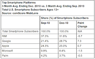
Anyway. Change is good. But bad change is bad. There is obviously a lot of competition in this space (we're winning in market share with 31.6% of smartphones, but Android is at 28.7% as of December and rapidly growing so who knows) and obviously something needs to be done to remain competitive. But to remove iconic, structurally sound design features in an (unsuccessful) attempt to incorporate the elements of rapidly growing alternatives in the market is just counter productive. Lets explore an example.
So yes, everybody was mesmerized by the horizontally scrollable "home screens" on the iPhone and Android. It feels more powerful to have all of the apps you want at the swipe of your finger, without having to press any buttons or enter any folders. I assume that this was realized during the development of the new OS, and that is good. But beyond this point of initial realization, two major mistakes were committed by making the formerly fixed icon bar on the bottom of the home screen into a scroll.


This first one is this: why change something that works well (especially when there are more glaring problems to address)? There's nothing WRONG with the six fixed icons on the home screen. Its organized, its predictable, its intuitive. The Application key is clearly placed; the way we access applications is actually one of the few things I don't have a major issue with.
But it is the second issue that is really the problem--introducing a change that makes the phone LESS functional. There's really no excuse for this. The few icons on the home screen represent the main applications we access. The point of isolating a few icons is to make them shortcuts, which enables pattern-induced behavior and allows us to get closer to the desired state of complete mental integration with our electronics. To introduce a scroll works against this endeavor; not only must we now pay attention when navigating to what used to be the cornerstones of our screen, but we were not even given the courtesy of the little dots that track our progress. You have effectively led us backwards into the blinding abyss from which we have appealed to you to save us.
(Plainspeak for this Matchstick: when you scroll a million times to the left, you're taken away from your main six home screen icons.)
So basically, give us back the anchored home screen strip and please defer from all ideas that make it more difficult to text under your desk during class.
Sincerely,
Tara Raffi
Stability Enthusiast
--


No comments:
Post a Comment